
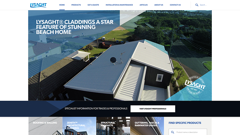
Lysaght’s revitalised online presence

Lysaght is a sheet metal rollformer (and Illawarra institution) formed in 1918 and now fully owned by BlueScope Steel. Despite being the market leader in their industry, their website had not been updated for more than 5 years and was showing its age:
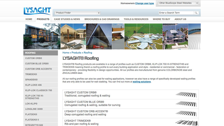
Lysaght.com before the redesign
…and the company’s home improvements brand Lysaght Living Collection wasn’t looking much better:
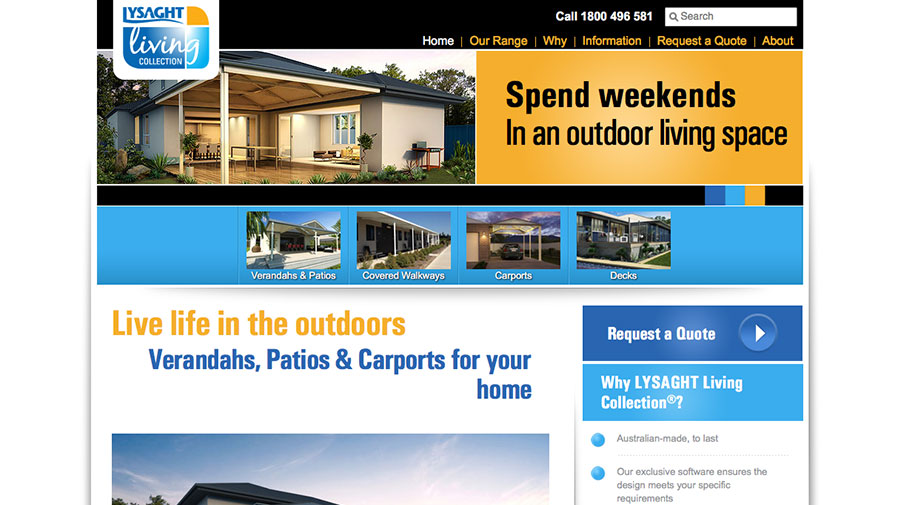
The Lysaght Living Collection website before we began
For the past three years, we’ve been working closely with Lysaght to overhaul their web presence and bring it up to scratch with modern best practices. Despite being somewhat neglected through the years, the sites enjoyed good traffic and the marketing team at Lysaght had amassed a great wealth of useful feedback and needs from its remote sales staff and customers. The opportunity to wipe the slate clean and fix long-standing issues had everybody motivated to do things right this time.
Managing Scale
As a user experience (UX) evangelist, I’m always spruiking user-centred design (UCD) to prospective customers and our entire process is built around the idea that it’s essential to know who you’re designing for and why you’re designing for them before you even consider the what or the how.
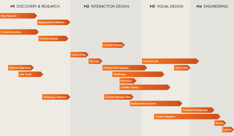
Our design process is closely modelled on Todd Zaki Warfel’s (above).
Lysaght was the first customer in a long time to invest in every stage of the process to make sure they got the result they needed. The scale of the undertaking became pretty clear early on, but getting a handle on that much complexity is not easy. For instance:
- The user & business needs workshop (sometimes run with fewer than 5 people) had 13 attendees, all providing valuable input.
- The project generated more personas than any project we’ve ever undertaken (a whopping 20 all up).
- Each persona had on average more than 6 requirements for a total of 129 user stories generated.
- As part of our market research, we identified and rated 11 competitor and 4 comparator brands. All up, the summary presentation of that research had an absurd 166 slides (mercifully we didn’t subject anyone to the entire presentation, but the final deliverable provides a useful snapshot of the industry at the start of the project).
- BlueScope requested that we build the site on an open-source content management system instead of our own proprietary IQ Control CMS. While we’ve all got some experience with various options, just doing our due diligence meant performing a thorough investigation of three different CMSes.
- Our card sort boasted 77 cards and 23 participants.
After all that upfront work, the key insight was that the needs of regular consumers and salespeople were fundamentally opposed to the needs of expert customers. In the end we made the unusual decision to produce multiple separate sites instead of a single catch-all site; one for Lysaght customers that featured non-technical language and a lot of in-situ photography and one for trade professionals, providing access to product specifications, CAD files and other technical resources.
For more details on the finished project, check out the project in our portfolio.
Applying the Brand Faithfully
With the Lysaght website being divided into two separate sites (Lysaght.com and Lysaght Professionals), we were presented with the awkward problem of trying to understand how to apply the same corporate brand identity in two distinct ways. The recent addition of the Lysaght Living website has only exacerbated that issue.
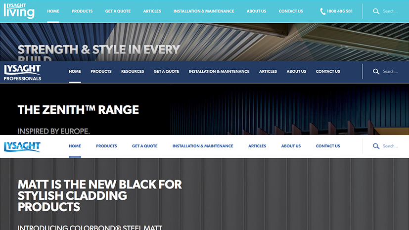
In the end we were able to divide the brand’s extensive colour palette into three separate groups, each sporting a similar but unique hero colour to build a family of sites that carry the same look and feel while maintaining their own individual identity.
The Handover
It’s easy to design a site that looks and works great when you get to curate every word, image and menu item inside software. The true test of any site’s success is how well it continues to serve its purpose after the reins are handed over to the site’s owners to add and modify content over time.
As noted above, the three Lysaght websites weren’t developed on our own minimalist proprietary CMS. Instead, they were built using Drupal, a popular open-source CMS. While that decision was the cause of much frustration during development, Lysaght’s website team have been able to manage the sites’ content with remarkably little modification since the site first went live.
Today the sites continue to get good feedback from customers, resellers, and Lysaght staff alike, and we’re proud of what we produced. The real test, of course, is how well the site holds up when it’s been live for 5 years. Just 3 ¼ years until we find out!