
On Rebranding

Today iQmultimedia officially becomes Studio IQ, completing a rebranding exercise that has been in the works in some form or another for 5 years. That means today we get to finally stop dealing with the worst, most indecisive client we’ve ever had: ourselves.
The Story So Far
In case you missed it, here’s what our site looked like yesterday:
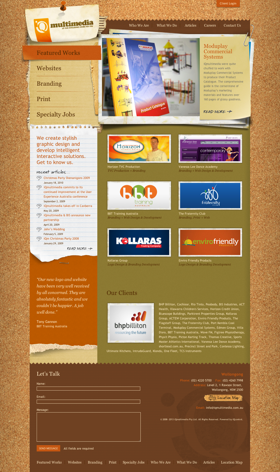
That site went live on the 19th of December, 2008 after more than 6 months of design and development work. At the time we were exceptionally proud of it, and we had a heap of great feedback from customers.
Our company was then a little over 2 years old and Barack Obama had just been elected President (for the first time). In the 4-and-a-half years since then, our company has changed dramatically, with the development and release of IQ LINK, more than a thousand projects and 22 employees have come and gone.
As a business, we’ve always struggled with our own identity. We were originally founded—with two employees—to build custom applications for touch-screen kiosks (from jukeboxes to bundy clocks). Once we brought in full-time design talent to help with that, though, our business instantly changed into one chiefly focused on the design and production of websites, with plenty of other graphic design services thrown in. Our business cards from that era even list among our services the production of “multimedia CD-ROMs”—it was in that context that the iQmultimedia brand was first designed (weird capitalisation and all).
When we were approached by BHP Billiton Illawarra Coal in 2007 to build iPICK, our development team outnumbered our design team four-to-one. Then five-to-one. And eventually development work represented the bulk of the work we were doing for our other customers too. Still, design was in our DNA; it was what attracted developers to working for us in the first place, and it was generally on the strength of our visual and interaction design talent that we kept so busy as a development team.
It was then—in early 2008—that the idea of a comprehensive rebrand was first raised. All of us recognised the baggage that the word “multimedia” carried with it, of the era of Shockwave Flash Projectors, QuickTime 3.0 and Microsoft Encarta. And while multimedia was originally intended to convey the broad range of services we offered, its meaning has always been highly ambiguous. At the very least, it didn’t do us any favours in communicating the sorts of varied technical work we were capable of. We knew, too, that our logo had legibility issues, and we knew all too well how hard it was to use Cooper Black tastefully.
Nevertheless we were busy, and we had so much printed collateral at this point (from letterheads and envelopes to business cards to flyers), not to mention a giant painted logo across the front of our building, that financially we couldn’t justify the expense of a rebrand. So we plodded along.
Before: iQmultimedia logo, circa 2006
After: iQmultimedia logo, circa 2009
By the middle of 2009, our work had changed even more. Instead of doing three jobs a day some days, I was spending three days on-site interstate just to produce the scope of work for a job that would take three months (or more) to complete. Out of a sense of duty to the gods of aesthetic decency we lipsticked the pig as best we could, and we began the painstaking task of a full-on rebrand.
The name “Studio IQ” had been floating around as long as the rebrand discussion had. We liked that it evoked both the creative and technical aspects of our business. We knew we would be retaining the “IQ” brand as long as we could, but we knew we’d be ditching the weird capitalisation that even we didn’t use consistently. We also felt a certain loyalty to the circle design that both logos to date had featured, even though we knew our customers had real trouble deciphering the IQ monogram itself.
When we began rebranding in earnest a year ago, the excitement in us who had been here through all the hypothetical rebrand discussions over the previous four years was palpable. We knew from experience that we wouldn’t have this opportunity again for a long time, if ever. The identity work we were producing for our customers was some of the best we had ever produced and we were keen to apply ourselves to a brand that we had all become so familiar with over time.
The Worst Client of All Time
Clients come in all shapes and sizes. Professionally, we’ve been fortunate to deal with a spectacular group of clients large and small. Branding (and especially rebranding) a business takes a surprising amount of time, regardless of the client. It’s not at all unusual for clients to see a branding task as little more than a logo or a set of business cards, and one of our first obligations as service providers is to give customers a better understanding of just how many steps are involved and how long they can all take.
Thinking of brand as simply a logo, stationery or company colours is a great understatement. A brand embraces everything from the customer’s experience and perception to the way it looks and the feelings it evokes. As such, a brand isn’t something you can take ownership of—it’s what your target audience perceives about you. Taken seriously, branding is chiefly a marketing activity; it needs to factor in the brand’s competitive landscape, the context of how it will be used (especially in signage and other non-print uses), search engine optimisation, domain name availability, social media implications, business name registration and/or trademarking, business objectives and much, much more; all before a pencil touches a piece of paper to design a logo.
It’s hard to communicate the need for that work to someone who’s anxious to get their business rolling under a new banner, and even harder when that time costs money. Why dedicate our time and resources towards such a large venture? As a company this was easy to answer: we wanted our identity to finally reflect who we really are and what we had become. We’ve done a lot of growing up over the years and wanted the new brand to reflect our maturity, but still echo our origins. We were long gone from producing CD-ROMs and small jobs with tight turnaround times and needed to steer our target audience to our broader set of talents and producing extremely high-quality work.
We started developing a new mission and vision statement, developing a new marketing strategy and an action plan that would focus on our unique value, core message and determine how best to communicate our message and make it memorable.
Even once the strategic components of a brand have been identified and a name or even logo is ready to be proposed, we generally need to switch gears and focus on selling the brand’s value to the internal stakeholders, persuading doubters and setting expectations. Many great branding exercises have run off the rails at this stage, especially rebrands which can suffer from internal stakeholders being used to the previous identity (or even people who were involved in its design) and thus being uncomfortable for any change, regardless of the value presented.
A “perfect” client—to the extent that one exists—is an autocrat whose singular agreement represents a sign-off of the work produced, but who feels utterly confident in our ability to produce spectacular work. This fictional client might be heard to say something like “even though I feel confident in my own eye for design, I trust your advice on this completely as what’s best for my business” or “this work wasn’t what I had in mind when I imagined it, but I’m convinced by your reasoning that the change will help my business”. Since we’re in a land of make-believe, why not add “this work is so good, I’d like to pay you double your standard rate”? When asked by Steve Jobs to provide ‘a few options’ for the NeXT logo, graphic design icon Paul Rand responded, “No, I will solve your problem for you and you will pay me. You don’t have to use the solution. If you want options go talk to other people”. The perfect client doesn’t just empathise with that attitude, they demand it when paying for our expertise.
Through the course of designing the Studio IQ brand, we found out we are most assuredly not that perfect client. It’s quite novel to sit on the other side of the table and to yourself be irrationally attached to existing brand material when trying to redesign it. When our design team had design work delivered for review we invariably all became armchair designers (not least of all those of us who are trained designers), second-guessing every typeface, every pixel, every PANTONE colour.
Despite having routinely championed the value of high-quality design services to clients as having an exceptional return on investment, as the clients we found ourselves questioning the value of every part of the process. Do we really need a brand guidelines document? Can’t we just use our existing brand material with the logo changed over? Is it a big deal if we leave all our previous signage up? Is it too late to defer the whole process a few years?
Most interestingly, we also set ourselves very unrealistic deadlines for the rebrand itself; once we had the new name, a logo ready to go, and some indicative idea of all the design collateral (from the website to business cards, to documents), we budgeted one month (around other work) for the brand to be ready to launch. We ended up taking more than three months from that point.
In the end, though, the extra time spent was a blessing. We had time to get far more content up on the website. We were able to get a bit funkier with things like our business cards and other marketing material than we first planned. For the first time in our company’s existence, we’ve given our MYOB templates the attention they deserve so we don’t cringe every time we invoice a customer. But as with so many things, the outcome is greater than the sum of its parts; and the best part of all is that the new identity has unprecedented buy-in from all of us here at IQ, meaning I’ve been able to experience the unique euphoria of a new brand launch from both sides of the table simultaneously.
For our existing customers, nothing much has changed. We’re still the same talented group of creative professionals, with a strong dedication to user experience and a reputation for exceptional customer service. It’s our hope that as Studio IQ, new prospects will be able to more quickly and easily see us in the same way.