Brand Refresh
After establishing themselves at the top of Australia’s SDA housing market, Enliven Housing had outgrown their visual identity and needed a collaborative partner to revitalise their branding to better reflect their values and future-facing position.
Having developed significant equity for its existing logo & colour palette, we made a conscious effort to only change what was necessary to breathe new life into the brand, with a specific focus on digital.
The logo in its existing form used the yellow spot colour to accentuate the letter ‘i’ and also used the letter as a standalone graphic element. The concept was well-loved by the business and its customers, but caused confusion for new customers (given “Enliven” doesn’t begin with the letter ‘i’). As a nod to the previous brand expression, we used the tittle (dot) of the letter ‘i’ from the logo in the brand’s typeface, leaning on its organic, imperfect shape to reflect the humanist personality of the brand.
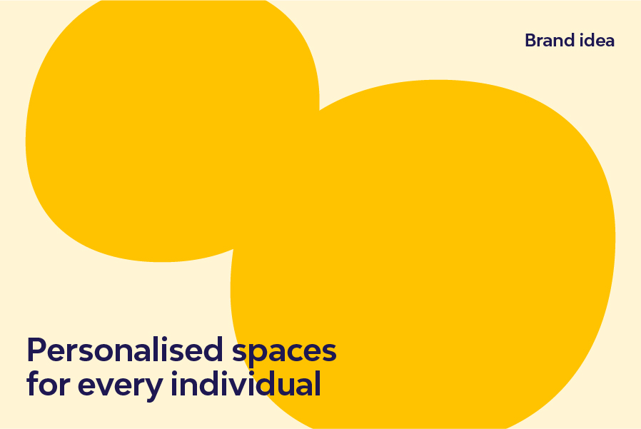
The brand refresh was built around a core brand idea of ‘personalised spaces for every individual’. This simple statement provided a scaffold to support tone of voice and key messaging decisions while reflecting the unwavering focus on the individual that is at the core of their business.
To balance out the organic and personable elements of the brand we also refreshed the supporting type treatment. By pairing the logotype with another typeface from the same foundry (Branding With Type), the two elements shared common DNA while providing much-needed variation and a contemporary feel.
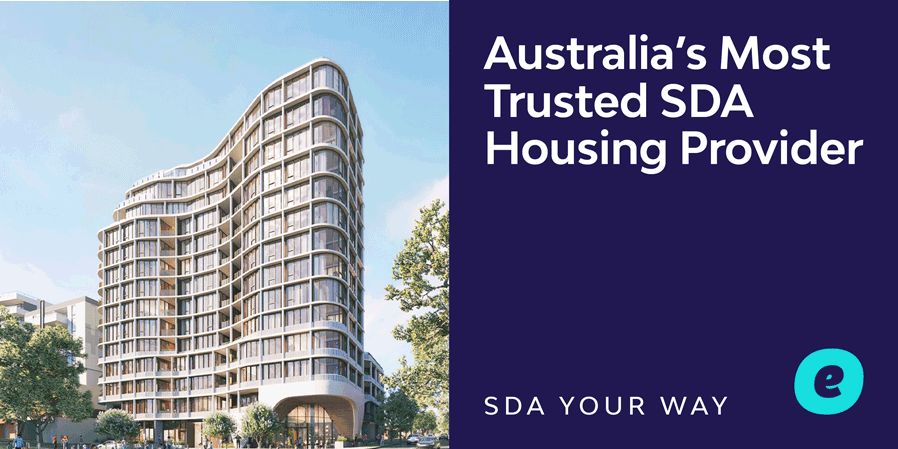
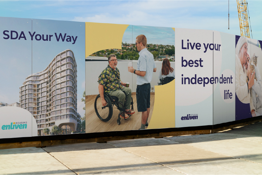
As a disability real estate provider, it was important to consider how the brand would pair with renders provided by architects and developers
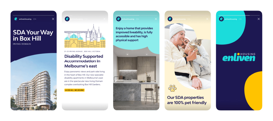
We provide a polished, repeatable foundation to allow the brand to produce high-quality social media content in-house.