
Designing the Kiosks for Wet’n’Wild Sydney

Our involvement in the Wet’n’Wild Sydney project began almost 2 years ago and almost 700km away, when our sister business IQ KIOSK provided three of their standard kiosks for ticketing at Movie World on the Gold Coast. Those three off-the-shelf kiosks quickly turned into an ambitious plan to roll out custom touch-screen kiosks at all their theme parks.
Wet’n’Wild chose to use an off-the-shelf software system made by their ticketing service provider on the kiosks, which wouldn’t be available for us (or anyone) to see or test against until barely a month before the park opened. The bad news: that made it dramatically more difficult for us to design the ticket machines as a single cohesive whole with software working in tandem with hardware. The good news: that decision freed our world-class design team up to help IQ KIOSK out with the hardware units themselves.
User-Centred Design
Here at Studio IQ, we’re big believers in the user-centric design (UCD) methodology. IQ KIOSK are an established business in their own right, but we were able to convince them to let us commandeer their project and apply the same proven process to hardware for the first time.
At Wet’n’Wild Sydney, the kiosks were intended to be one of the first points of contact between the park and its visitors (meaning getting them right—or wrong—could have a substantial effect on the happiness of their customers).
Research
Before beginning with any of the design process, we knew we needed to do research into the needs of the kiosks’ future users. Since the Sydney park was still under heavy construction, we began by visiting each of the customer’s existing theme parks on the Gold Coast and observing the way queues formed (both deliberately and organically), interviewing box office staff, timing each part of the ticket sale process and gathering as much empirical data as we could get our hands on.
By now, we’re familiar with designing software for kiosks, so we were able to apply a lot of our previous research into designing unattended systems to the design of these kiosks themselves (for instance, we know accessibility is a constant concern with any system designed for use by the general public, so we needed to test every decision with users of many different sizes, skill levels and needs).
With the proliferation of touch-screen ticket kiosks lately, there are a lot of existing solutions to draw inspiration from (and others that help demonstrate problems to avoid):
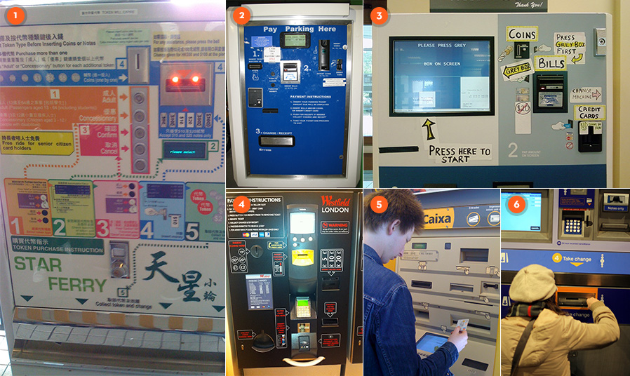
In all the above usability issues, it seems the machine was designed first and foremost to make the machine itself easy to build, fill and service. While those factors are no doubt incredibly important considerations, our user-centric model forced us to consider the implications of the placement of each component to make them easily accessible and logical without any dense additional informational signage, and we were determined to do everything within our power to avoid our kiosk design ending up in the UX Errors Flickr group.
Concept and design
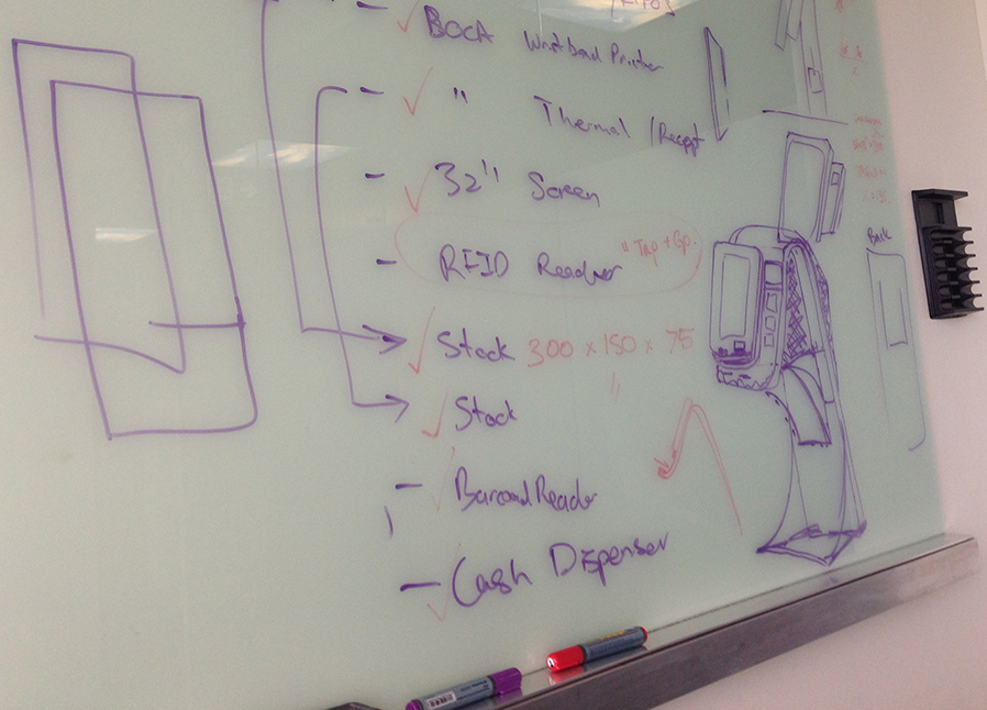
Following review of our research, the documented software system requirements and the client’s budget and business constraints, the first task was to identify the specific components required for specialty uses (such as the wristband printer, RFID scanner, credit card payment hardware, security camera and barcode scanner). Once we had the non-negotiable components figured out, we were free to figure out for ourselves which other components (like display, receipt printer, banknote acceptor and banknote dispenser) would best address the users’ needs.
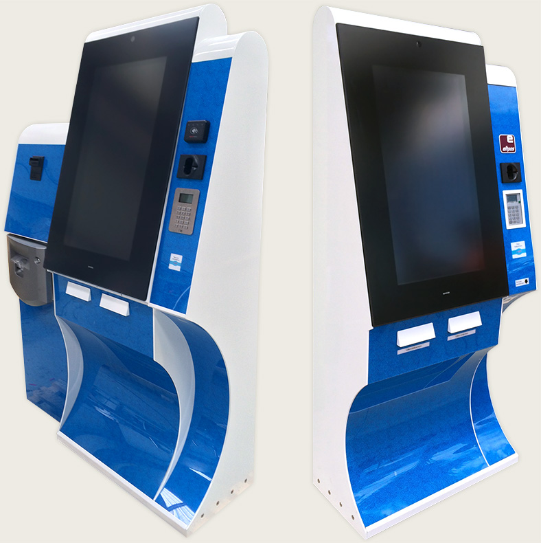
Wet’n’Wild wanted the kiosks to do double-duty as digital signage when they weren’t in use, which meant we needed a large screen, rated for use in direct sunlight. Large touch-screen displays are very susceptible to parallax error and can easily be too large for the user to take in all at once, so very early on we decided to mount the display in a portrait orientation (i.e. vertically).
As though making the screen legible in the sunlight wasn’t enough of a challenge, we also knew that the machines would need to be able to handle more than a little rain (despite needing to dispense printed tickets and receipts).
As always, our collaborative design approach meant we did a lot of work on whiteboards, iterating quickly to see if we could accommodate all the components without resorting to the classic “big metal box” design so many other ticket machines use.
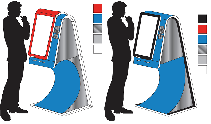
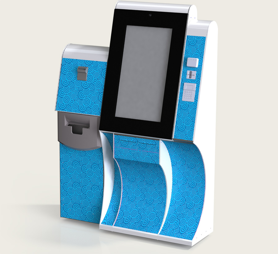
From the very first design meeting, we took cues from the (then still hypothetical) Wet’n’Wild Sydney architecture, which used wave and other organic, water-based shapes heavily.
Quickly, we converged on a concept of a kiosk with a deep wave-shaped cut out beneath the screen. From the user’s perspective in front of the kiosk, this design would reduce the apparent volume of the unit, making them less imposing and maintaining the park’s fun brand.
Since the concept was more radical than originally expected, we enlisted a local artist to illustrate multiple variations of the concept for the client to review, which were quickly approved.
The Height and Angle of the Display
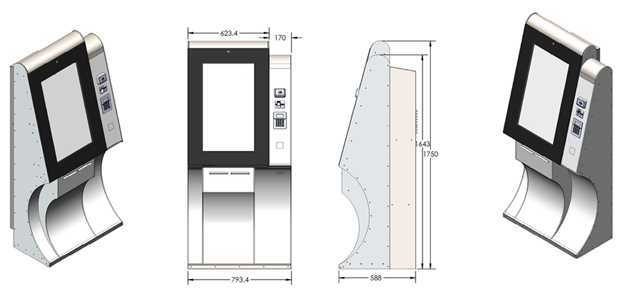
With the client so happy to proceed with the wave shape, and us confident it could be accomplished without sacrificing any usability or technical requirements, we next needed to determine the height and angle of the screen.
The vast majority of the user’s interactions with the kiosk occur through the touch-screen, so it’s worth a lot of our attention. Getting the height right (like everything else) was most easily accomplished by making a reasonable estimate, testing it on real people, and iterating on it accordingly. We based our first estimate on something we knew—the height of the standard IQ KIOSK screen. Since the Wet’n’Wild kiosk has a much, much larger screen, we knew that height would almost certainly need to change, so we drew the screen to scale on a whiteboard and tested it against interface wireframes printed to scale, and with users that of different height, representative of the Australian population for our target age groups (the Australian Bureau of Statistics records all sorts of great information like this for people like us).
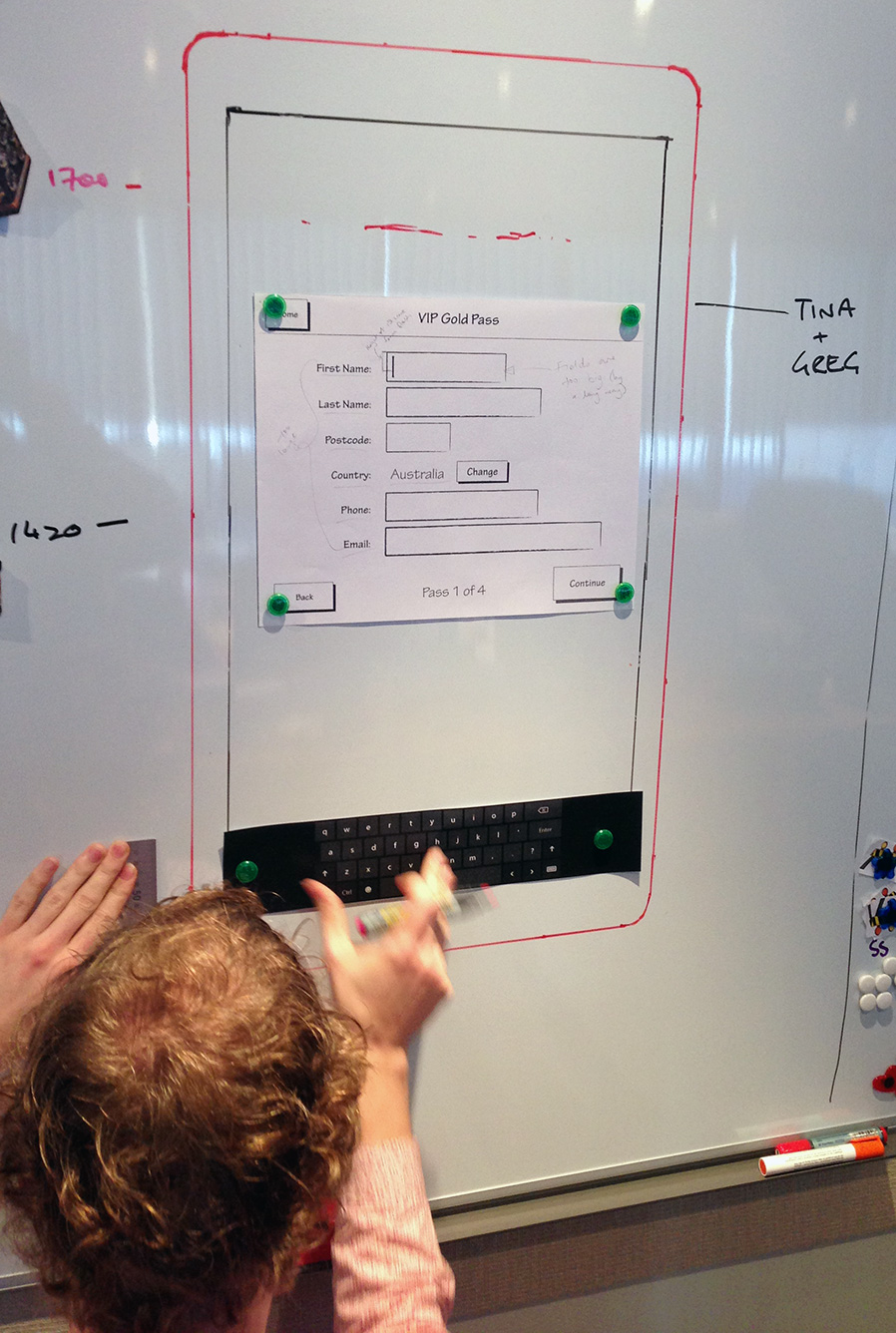
It’s a heck of a lot cheaper to test things like the height of a display on a whiteboard than it is in metal! By testing the interface in different configurations and on different users, we were able to establish the height of the screen
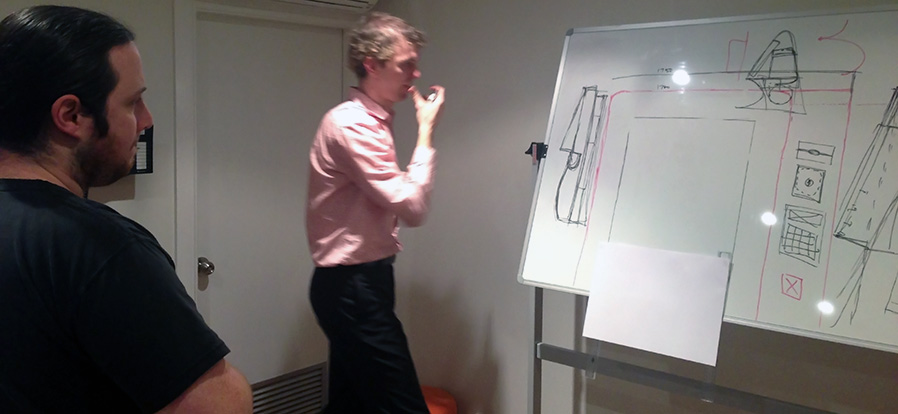
Once we determined the height that could be comfortably used by a wide array of the general public, we turned our attention to the screen’s angle—something that’s deceptively important when designing any large-format touch-screen kiosk.
Since you use your whole arm when you interact with a large-format touch-screen kiosk, and your shoulder is relatively high up on your body, tilting the screen at just the right angle relative to the size and position of the screen keeps all parts of the screen a similar distance from their body (and eyes), reducing the need for the user to change their position to comfortably use the kiosk.
For this, we again drew the display to scale, this time on an adjustable whiteboard, and experimented with various angles for the same broad set of users.
It might be crude, but it’s amazing what you can accomplish with a whiteboard, a couple of rulers and a sheet or two of A3 paper
After many rounds of experimentation, we finally arrived at an angle of 15° from vertical.
We weren’t completely done with our rapid prototyping yet, but finally we were ready to begin working on the design in the computer.
Low-fidelity hardware designs (“wireframes”)
We used the terrific SketchUp to produce the engineering equivalent of low-fidelity wireframes. By working in three dimensions as early as possible, we were forced to design to scale, and to accommodate the true size of all the components that we were planning to integrate with.
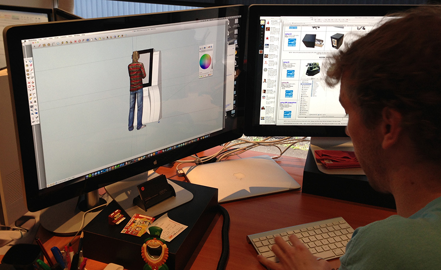
For the most part, we focused on the aesthetics and usability of the kiosk in this stage (ignoring most of the technical and engineering challenges we were setting for ourselves). After more than 20 rounds of revision we eventually came to a design that isn't dramatically different from the final product.
We decided to make the display the hero of the design since it’s the first (and certainly most important) component of the kiosk that users need to interact with. We moved all the payment components into a visually-separate “shoulder”, which was reduced in height from the screen and set back to quickly indicate its secondary importance and to reduce the apparent size of the kiosk when standing in front of it.
The RFID and barcode scanners were placed in locations that made them easiest to use as designed (that meant putting the RFID scanner at a height that was easy to put your wrist against and the barcode scanner pointing downward to allow the user to easily line it up against the barcode on their printed or mobile tickets).
Finally, we nestled the printers for the wristband and receipt at the bottom of the screen, since they’re the last stage in the purchase process.
We found a way to accommodate the large air conditioner units required to keep the displays (and computers) cool by adding a single vertical channel at the back of the unit. By keeping this section only as narrow as it needed to be we were able to reduce the apparent thickness of the kiosk dramatically and preserve the relatively tight radius over the top of the screen and the shoulder.
Paper prototype
Once we were reasonably certain we had the design more-or-less correct, we still needed to test those assumptions.
Drawing again from the suite of tools we use for software systems, we knew a paper prototype would be a great way to allow us to test our design on real users before investing tens of thousands of dollars into full-scale engineering.
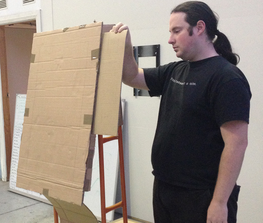
Using pieces of old cardboard boxes, tape and a hand trolley we were able to produce a full-scale cardboard prototype of the kiosk. The prototype was tested by the same broad range of users as earlier stages. Participants pretended to scan their wristbands and barcodes from their phones, to type on a printed on-screen keyboard and to touch buttons of different size and position on the screen to identify possible issues with button placement. We tested the positioning of the various card payment components (contactless payments, magnetic card reader and pin pad) until we felt they were in the order and position a majority of users expected. It proved very successful in discovering usability issues and design flaws before formal engineering began.
Engineering
We were finally confident that we could move to full engineering. We collected the official CAD drawings for all the components we were integrating and—starting from our SketchUp models—built up the real kiosks in software.
This was the stage where we finally had to start thinking about where cables would go, how we’d channel any water ingress away from critical components, how airflow from the air conditioner might be handled, and the placement of every rivet, bolt, weld and screw.
Perhaps the biggest issue we had to solve, though, was the pneumatic struts we were planning to use to raise the screen. Throughout all our rounds of design and development, we’d never fully understood just how heavy the high-brightness screen and front touch glass would be.
Slowly but surely, we were able to design a kiosk that—in theory—would work for all our different requirements.
Prototype
Of course, a design in CAD is nothing more than a theoretically working unit. Next came the most expensive part: producing a real prototype unit in metal, and integrating the real components in situ.
Our concept had come to life and provided us with specifications for a real, working unit. This was the definitive proof of concept and allowed us to conduct a final check for design flaws and last-minute improvements. In the end, we dramatically redesigned the display struts and hinge, as well as reconfiguring a lot of the internal shelving to improve water management and reduce the likelihood of printer jams.
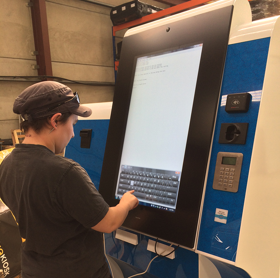
The prototype kiosk was delivered to the clients to help with integration testing for their software, and we were given the go-ahead to proceed to the full production run.
Production
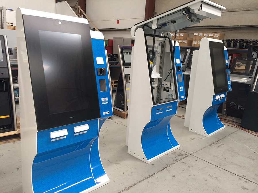
After months of development and testing it was a great relief to see a workshop full of identical, great-looking kiosks that nailed the client’s brief and were ready to deploy on-site in time for opening (despite us needing to change many of the internal components for software compatibility reasons throughout the project).
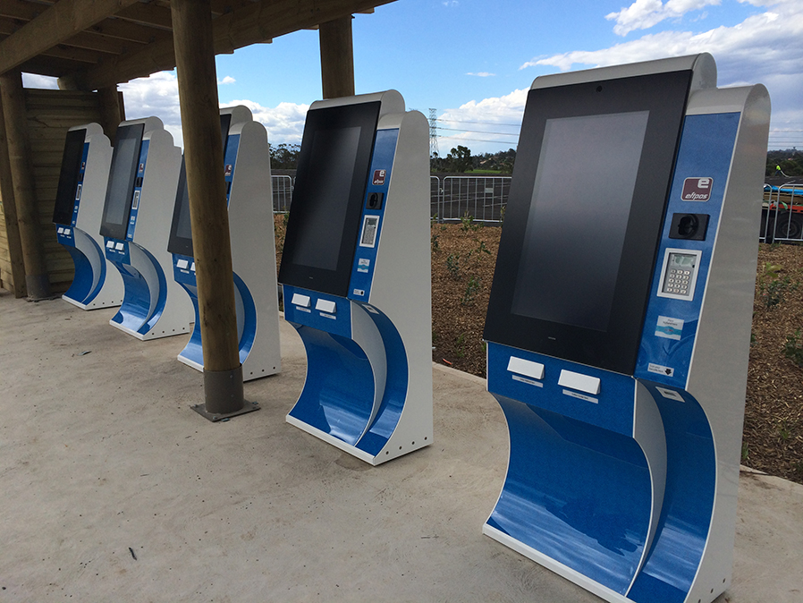
While we would have relished the opportunity to work on both the software and hardware parts of the job, we are extremely proud of the final product we designed, produced and delivered to Wet’n’Wild and we always love seeing how beneficial the user-centric design methodology proves to be to the client as well as the user.