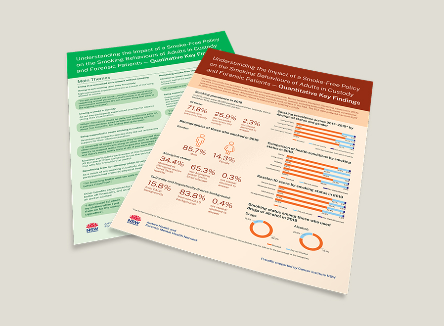
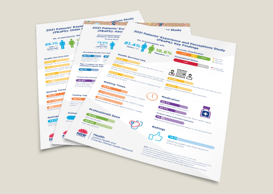
Poster & Factsheet Design
The Justice Health & Forensic Mental Health Network produce factsheets from many of their longer research reports to distil key findings into a digestible form that can be distributed in and outside the correctional facilities they cover.
By using principles of information design, we’ve helped them make their most critical findings accessible to as many people as possible.
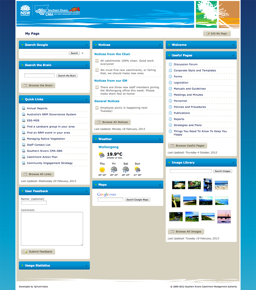
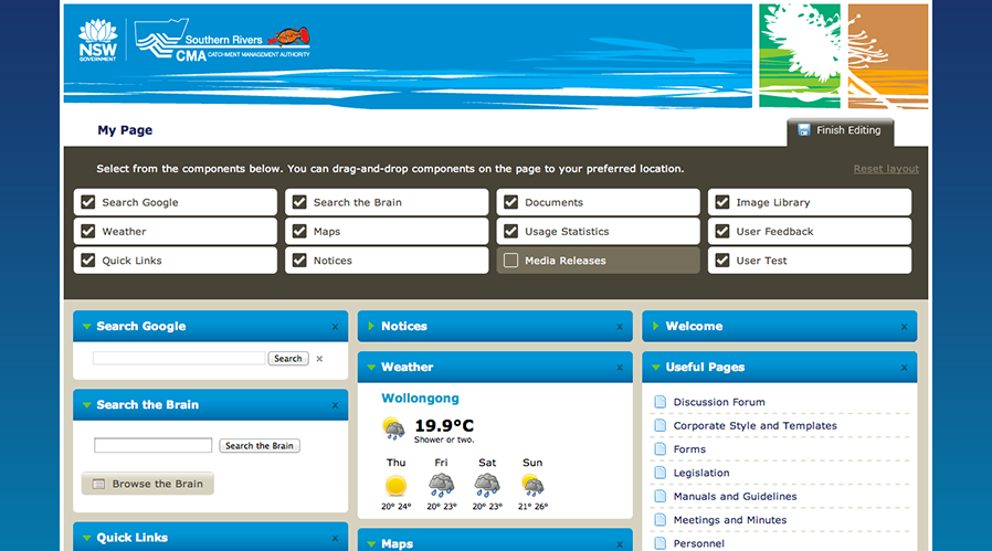
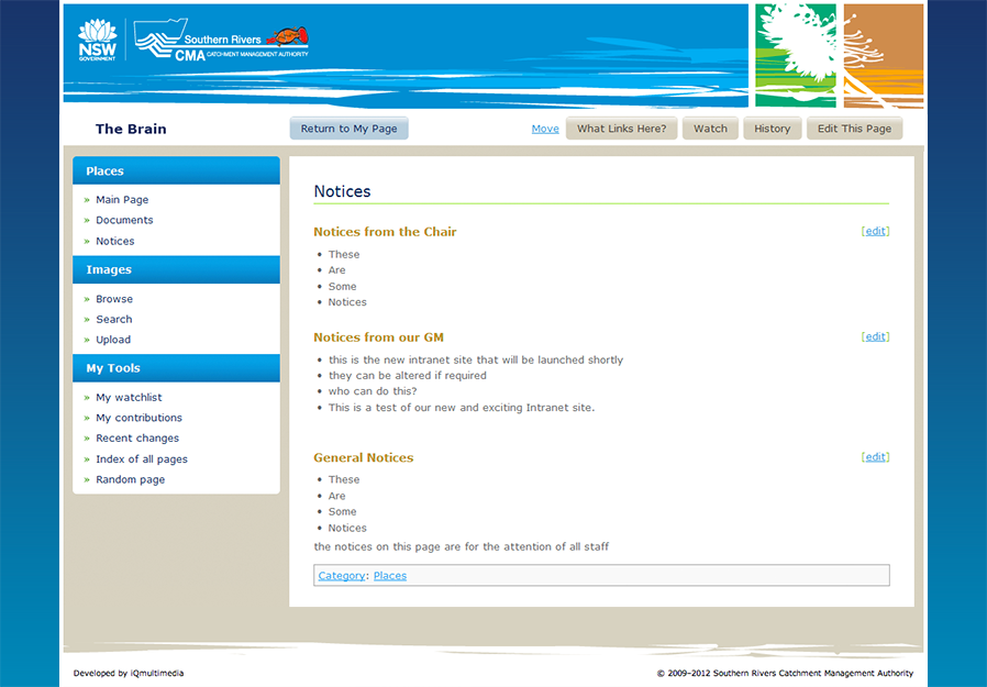
Southern Rivers CMA Intranet
Southern Rivers Catchment Management Authority (SRCMA) is a NSW Government agency responsible for the protection and restoration of water catchments in the southern part of NSW.
We worked closely with SRCMA to develop a scalable, user-customisable intranet in two parts; My Page, a highly flexible “dashboard”-style web page designed to serve as users’ browser home page; and The Brain, a heavily customised version of the popular MediaWiki software.
The system provided a wide array of drag-and-drop modules that could be added, removed and rearranged on demand to meet each user’s varied needs.
With help from their IT service team, we were able to develop a custom engine for single sign-on so users didn’t have to type their credentials in at all (but could still see their own, customised home page on any computer they logged into).
Modules such as weather use the user’s current location to provide the relevant information directly from the Bureau of Meteorology.
Other modules pull information from other intranet systems, the SRCMA website and the wiki.
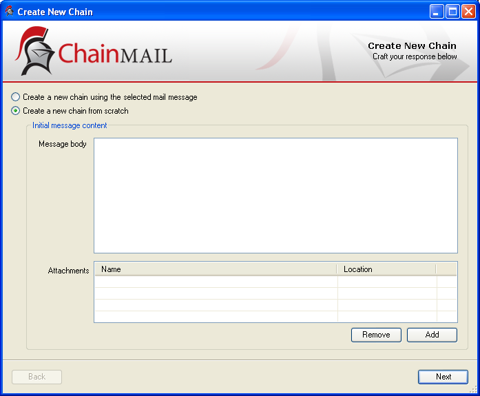
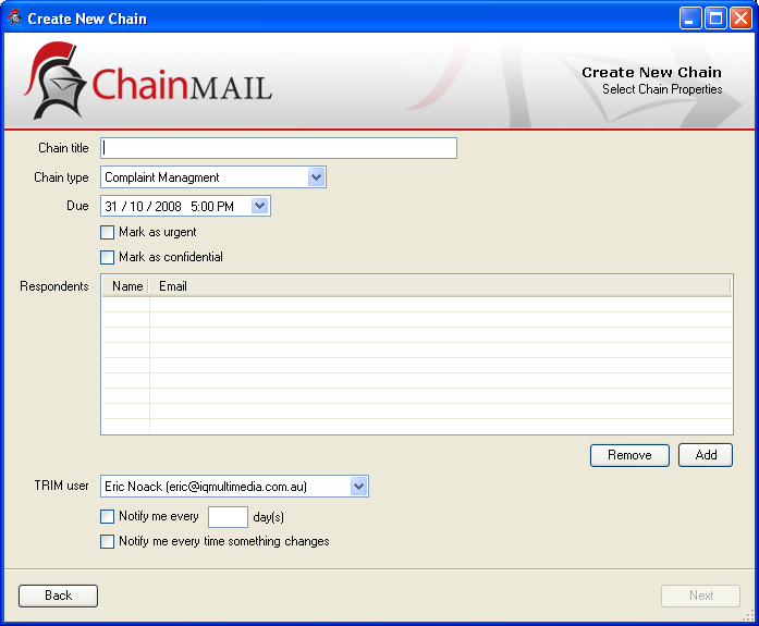
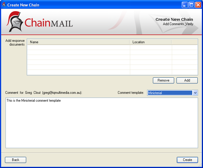
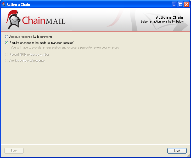
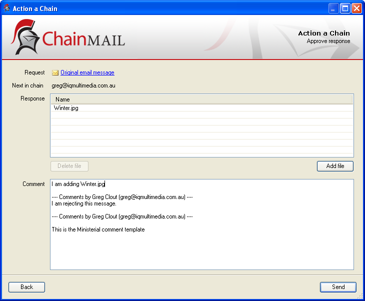
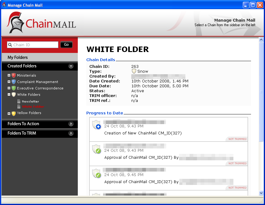
Chain Mail
Built for NSW Health, Chain Mail was designed to provide a simple interface to the approval workflow for outgoing communication. Formal outgoing correspondence requires review by many internal staff, often across multiple physical locations.
Chain Mail was built as a Microsoft Outlook plugin, the app allowed users to take an email they had received and begin a workflow to respond to it. Each member in the workflow (or “chain”) received the message as an email, each of which was shown with a colour-coded shield representing different types of chain.
A separate server application was written to manage the state of all chains in progress, and to maintain a full searchable audit log of the previous chains.
Along with the software itself, we designed the Chain Mail brand itself, applying the familiar idea of chain letters with the idea of chainmail armour. The icon combined both an envelope and a knight’s helmet to provide a unique and memorable symbol. Chains themselves were represented by colour-coded shields to carry the armour imagery even in very small sizes.